Understanding candlestick patterns is a crucial cryptocurrency trading skill that can help you make informed decisions and increase your chances of success. Candlestick charts are widely used in technical analysis and provide valuable insights into price movements.
I’ll break down the basics of candlestick patterns in crypto trading, giving you the knowledge and confidence to navigate these charts with ease. Whether you’re a beginner or an experienced trader looking to sharpen your skills, this guide will provide you with the foundation needed for profitable trades.
What are candlestick charts?
Candlestick charts are a popular and powerful tool used by traders and investors in technical analysis to visualize price movements, understand market sentiment, and predict the future. They provide a more detailed representation of the market compared to traditional line charts. Each candlestick on the trading chart represents a specific time period, whether it’s minutes, hours, days, or weeks.
These patterns resemble the shape of candles and I will explain how the structure of the candlestick provides valuable information about market psychology. Explore bit 360 ai to discover how you can make your financial dreams come true.
A single candlestick has four main components: the open, close, high, and low prices.
The body of the candlestick represents the range between the open and close prices during that period.
If the closing price is higher than the opening price, it creates a bullish (or green) candlestick indicating upward movement.
On the other hand, if the closing price is lower than the opening price, it forms a bearish (or red) candlestick suggesting downward movement.
The top part of each candlestick is called an upper wick or shadow and shows how high prices reached during that period. Conversely, the bottom part known as a lower wick or shadow indicates how low prices dropped.
By analyzing these patterns on different timeframes such as hourly or daily charts, traders can identify trends and make predictions about future price movements. Reading these charts effectively requires knowledge of various candlestick patterns which we will explore further in this article.
Understanding the parts of a candlestick chart

The first part of a candlestick chart is the body, which represents the range between the opening and closing prices during a specific time period. A filled or colored body indicates that the closing price was lower than the opening price, while an empty or transparent body suggests that the closing price was higher than the opening price.
Next, we have two thin lines called wicks or shadows. The upper wick represents the highest point reached by Bitcoin’s price during that given time period, while the lower wick shows its lowest point. Traders pay close attention to these wicks as they can indicate potential reversals in trend.
The length of both the body and wicks can vary greatly depending on market volatility. Longer bodies suggest significant buying or selling pressure, while shorter bodies imply less intense activity in terms of trading volume.
There are also patterns formed by multiple candlesticks in succession that provide further insight into market trends. We will look at these patterns in the following sections.
How to read candlestick charts
Candlestick charts are one of the most commonly used tools in technical analysis for trading Bitcoin. However, understanding how to read these charts can be a bit overwhelming for beginners. But fear not! Once you grasp the basics, you’ll be able to interpret price movements like a pro.
To read candlestick charts, start by examining each candlestick.
Each candlestick represents a specific time interval. Depending on how you set the chart to be, it could be every 5 minutes, 15 minutes, or 30 minutes. Others set it to be hourly, or daily. For every trading platform, you have the option of adjusting these time intervals. When you want to trade daily, it is advisable to use shorter time intervals.
Next, pay attention to how the candles are positioned relative to one another. If a series of candles has higher highs and lows than previous ones, it indicates an uptrend. Conversely, lower highs and lows suggest a downtrend.
Also, look out for specific patterns formed by multiple candles such as doji patterns (where open and close prices are almost equal) or engulfing patterns (where one candle completely engulfs the previous one). These patterns provide valuable insights into market sentiment and potential reversals. I will talk more about these patterns later.
Interpreting price movement on a candlestick chart
The body of the candlestick, also known as the “real body,” shows the opening and closing prices for that period. A filled or colored body indicates a bearish signal, where the closing price is lower than the opening price. Conversely, an unfilled or hollow body suggests a bullish signal, with the closing price higher than the opening price.
The length of the upper and lower shadows, known as “wicks” or “tails,” indicate how much volatility occurred during that time frame. The longer these shadows are, especially when compared to other candles nearby, may suggest increased buying or selling pressure.
Pay attention to patterns formed by consecutive candles. For example, if you notice several bullish candles in succession (higher closing prices), it could indicate an uptrend or buying momentum. On the other hand, multiple bearish candles (lower closing prices) may signify a downtrend or selling pressure.
Different Types of Basic Candlestick Patterns
The patterns in trading can be observed on a single candlestick or multiple candlesticks. As I explain each pattern, I will indicate if it is for single or multiple sticks.
Doji Candlestick Pattern
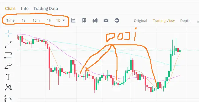
The first basic candlestick pattern is the doji, which indicates indecision in the market. This can be observed on a single candlestick. It occurs when the opening and closing prices are very close, resulting in a small or non-existent body. A doji suggests that buyers and sellers are evenly matched, potentially signaling a reversal or consolidation period.
Hammer Candlestick
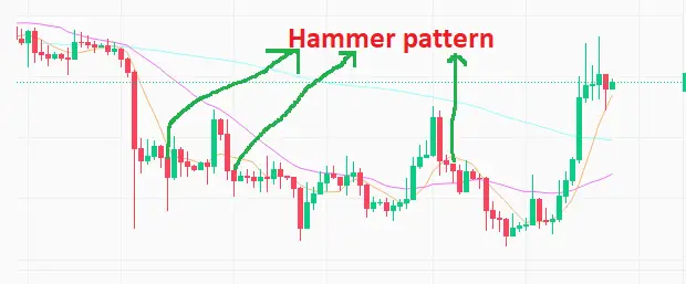
Another common pattern on a single candlestick is the hammer, characterized by a long lower wick and a short body near the top of the candle. This bullish pattern indicates that buyers have regained control after an initial decline.
The most reliable candlestick pattern in bitcoin trading is known as the “hammer.” This pattern forms when the price opens near its high, then drops significantly during the trading session, only to recover and close near its opening level. The shape of this candlestick resembles a hammer, with a small body and a long lower shadow.
Traders consider the hammer pattern to be significant because it often indicates a potential reversal in trend. When this pattern appears after a downtrend, it suggests that selling pressure may be weakening and buyers are starting to enter the market. Conversely, if the hammer appears after an uptrend, it could signal that buying momentum is fading and sellers may soon take control.
To confirm the reliability of a hammer pattern, traders look for additional bullish signals such as increased volume or other chart patterns forming concurrently.
Shooting star
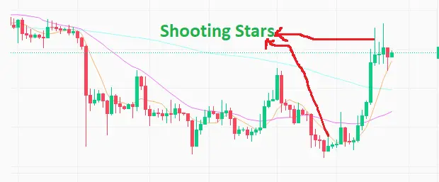
The shooting star pattern has a long upper wick and a small body at the bottom of the candle, suggesting potential bearishness. It is observed on a single candlestick.
The Spinning Top Pattern
The spinning top is another important pattern to watch out for. It occurs when both buyers and sellers are active but unable to gain full control over price movement. The spinning top typically signifies uncertainty in the market.
The Engulfing Candlestick Pattern
There’s the engulfing pattern where one candle completely engulfs (or “eats up”) the previous one. This can be either bullish or bearish depending on whether it’s an upward or downward engulfing respectively.
The “Morning Star” pattern
The “Morning Star” pattern consists of three candles: a large bearish one, followed by a small-bodied candle indicating indecision, and finally, a large bullish one confirming an upward trend change.
Bullish and bearish candlestick patterns
These are observed when viewing multiple candlesticks over a given period.
A bullish candlestick pattern indicates that the price is likely to rise or continue its upward trend. One common bullish pattern is the “bullish engulfing,” where a small red (or bearish) candle is followed by a larger green (or bullish) candle that completely engulfs the previous one. This suggests a shift from selling pressure to buying pressure.
Bearish candlestick patterns indicate that the price may decline or continue its downward trend. The “bearish harami” is an example of such a pattern, characterized by a large green (or bullish) candle followed by a smaller red (or bearish) candle within its range. This signals potential weakness in the market and could lead to further selling.
It’s crucial to remember that no single indicator or pattern guarantees success in trading; instead, they serve as additional tools to guide decision-making processes. These patterns are useful for the prediction of possible trading sentiments and should not be seen as tools for certainty or guarantee of the direction of the market.
By combining technical analysis techniques with other forms of analysis, traders can increase their chances of making profitable trades based on these powerful indicators
Continuation candlestick patterns
Continuation candlestick patterns are a type of chart pattern that provides insight into an ongoing trend in cryptocurrency trading. These patterns indicate that the current trend is likely to continue, rather than reverse or change direction.
“Flag” pattern
One common continuation pattern is called the “flag” pattern. This pattern occurs when there is a sharp price movement followed by a period of consolidation, forming a flag shape on the chart. The flag acts as a pause in the market before it resumes its previous trend. Traders often look for breakouts from these flag patterns as an indication of further upward or downward movement.
The pennant pattern
Another continuation pattern is known as the “pennant.” Similar to the flag pattern, this formation consists of a strong price move followed by consolidation. However, unlike flags which have parallel lines for support and resistance, pennants form triangular shapes with converging support and resistance lines. Breakouts from pennant patterns can signal significant momentum in either direction.
The wedge
The third continuation pattern worth mentioning is called the “wedge.” This formation occurs when two sloping trendlines converge towards each other, creating a narrowing range between them. Wedges can be ascending (bullish) or descending (bearish). A breakout above or below the wedge indicates that traders should expect continued movement in that direction.
Practicing reading candlestick patterns
Practicing reading candlestick patterns is essential for any trader looking to navigate the volatile world of Crypto and Bitcoin trading. While it may seem intimidating at first, with some practice and dedication, you can become proficient in interpreting these charts and make informed trading decisions.
To start practicing, find a reputable charting platform that provides candlestick charts such as Binance, eToro, Coinbase, etc. Familiarize yourself with the different elements of a candlestick pattern: the body, which represents the price range between the opening and closing prices; and the wicks or shadows, which indicate how high or low the price has fluctuated during a specific time period.
Next, begin analyzing various candlestick patterns. Look for common formations such as doji candles, hammer candles, engulfing patterns, and shooting star candles. Each pattern tells its own story about market sentiment and potential price movements.
As you gain more experience in reading candlestick patterns, start paying attention to factors like volume and trend lines. Volume can validate or invalidate certain signals provided by candlestick patterns while trend lines can help determine if a pattern is part of an ongoing trend or just a temporary fluctuation.
Remember that mastering reading candlestick patterns takes time and effort. Practice consistently by studying historical charts, keeping up with market news events that impact Bitcoin’s value, and backtesting your analysis against real-time data. With patience and persistence on your side, you’ll gradually develop confidence in your ability to interpret these powerful tools accurately.
The significance of wicks on candlestick charts
The significance of wicks on candlestick charts cannot be understated in the world of cryptocurrency trading. Wicks, also known as shadows or tails, provide crucial information about the price movement and market sentiment during a given period.
In a candlestick chart, each individual candle represents a specific time frame, such as 1 minute or 1 hour. The body of the candle shows the opening and closing prices while the wicks extend above and below the body to indicate the highest and lowest prices reached during that time frame.
The length and direction of the wick can reveal valuable insights into market dynamics. For example, long upper wicks suggest that sellers have pushed prices higher but were ultimately overwhelmed by buyers who brought them back down. Conversely, long lower wicks indicate strong buying pressure followed by seller dominance.
Wicks can also help identify key support and resistance levels. If a stock consistently has long lower wicks near a certain price point over multiple candles, it suggests that there is significant demand at that level, making it a potential area of support for future price movements.
Conclusion
A good knowledge of candlestick patterns is a fundamental skill for anyone interested in trading. By analyzing these patterns on a candlestick chart, traders can gain valuable insights into price movements and make more informed decisions.
Learning to read candlestick charts involves understanding various patterns that indicate potential reversals or continuations in price trends. Bullish patterns such as hammer, engulfing, and morning star suggest upward momentum, while bearish patterns like shooting star, dark cloud cover, and evening star indicate downward pressure.
There are also continuation patterns that suggest the current trend will continue. These include flags, pennants, and wedges. Recognizing these patterns can help traders anticipate future price movements and adjust their strategies accordingly.
Becoming proficient in reading candlestick charts and identifying patterns accurately requires practice. Traders should spend time observing historical data and comparing it to actual market conditions to strengthen their pattern recognition skills.
While there are many reliable candlestick patterns to consider when making trading decisions, one pattern stands out as particularly significant – the doji. A Doji occurs when the opening and closing prices are very close or equal; it signals indecision in the market. Traders often use this pattern as an early indication of potential trend reversals.
Another important aspect of reading candlestick charts is paying attention to wicks. Wicks represent intra-period price fluctuations that were eventually rejected by buyers or sellers. The length of wicks provides insight into buying or selling pressure during a given time frame.

Nansel is a serial entrepreneur and financial expert with 7+ years as a business analyst. He has a liking for marketing which he regards as an important part of business success.
He lives in Plateau State, Nigeria with his wife, Joyce, and daughter, Anael.
